datawrapper a light-weight wrapper around the Datawrapper API#
yeah I know… it’s a lot to wrap your head around.
To use datawrapper you’re going to need a Datawrapper access token. If you have a Datawrapper.de account go to https://app.datawrapper.de/account/api-tokens.
If you don’t have a Datawrapper.de account, sign up for one. They’re free.
First we’ll import the Datawrapper class from datawrapper and pandas so we can add some sample data.
from datawrapper import Datawrapper
import pandas as pd
datwrapper.Datawrapper will load your access token if you have it as an environment variable DATAWRAPPER_ACCESS_TOKEN. If not, you’ll have to pass it manually.
ACCESS_TOKEN = "<YOUR_API_ACCESS_TOKEN_HERE>"
dw = Datawrapper(access_token=ACCESS_TOKEN)

dw.get_my_account()
{'id': 163125,
 'email': '',
 'name': 'chekos',
 'role': 'editor',
 'language': 'en-US',
 'chartCount': 34,
 'url': '/v3/users/163125'}
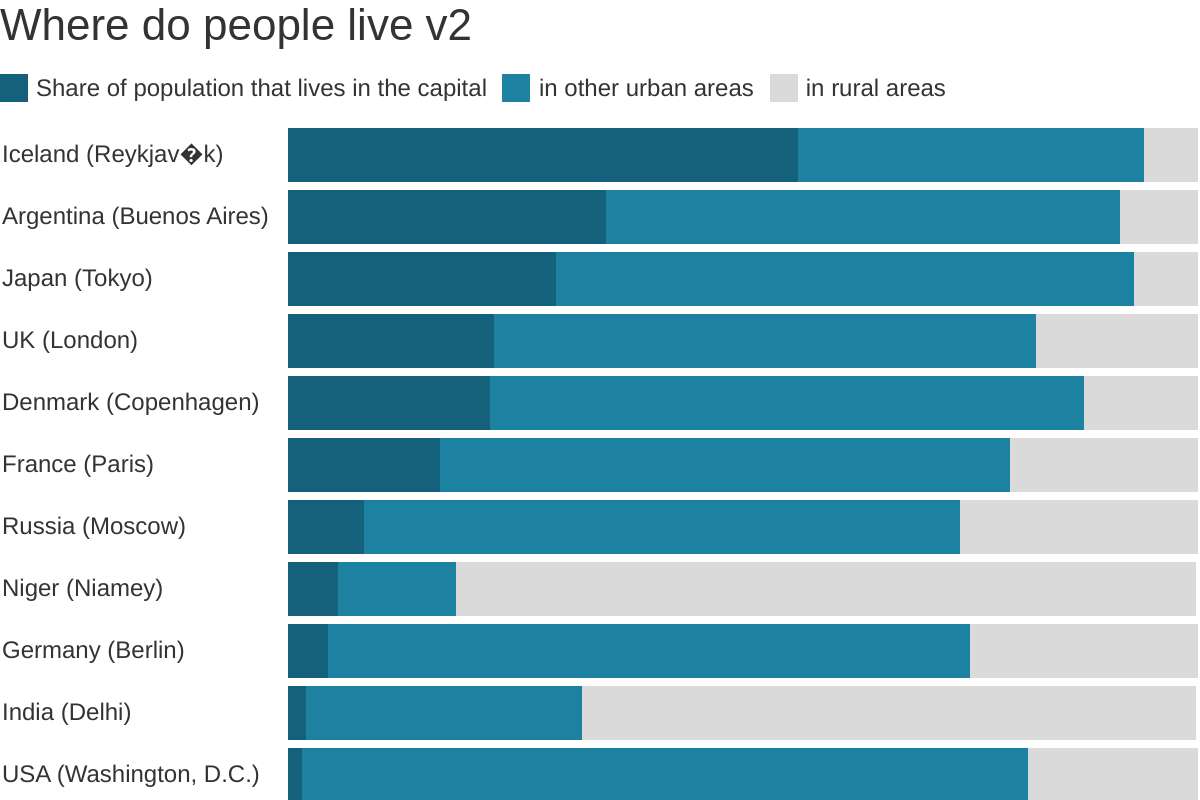
We’ll use the same data the Getting Started tutorial from the API docs uses.
df = pd.read_csv(
    "https://raw.githubusercontent.com/chekos/datasets/master/data/datawrapper_example.csv",
    sep=";",
)
df.head()
| country | Share of population that lives in the capital | in other urban areas | in rural areas | |
|---|---|---|---|---|
| 0 | Iceland (Reykjavík) | 56.02 | 38.0 | 6.0 |
| 1 | Argentina (Buenos Aires) | 34.95 | 56.6 | 8.4 |
| 2 | Japan (Tokyo) | 29.52 | 63.5 | 7.0 |
| 3 | UK (London) | 22.70 | 59.6 | 17.7 |
| 4 | Denmark (Copenhagen) | 22.16 | 65.3 | 12.5 |
To create a chart and add data in one call just use datawrapper.create_chart() and pass the pandas DataFrame as the data argument. It will return a JSON with your new chart’s information.
chart_info = dw.create_chart(
    title="Where do people live?", chart_type="d3-bars-stacked", data=df
)
New chart d3-bars-stacked created!
chart_info
{'title': 'Where do people live?',
 'theme': 'default',
 'type': 'd3-bars-stacked',
 'language': 'en-US',
 'metadata': {'data': {}},
 'authorId': 163125,
 'id': 'HElug',
 'lastModifiedAt': '2019-12-17T17:38:48.935Z',
 'createdAt': '2019-12-17T17:38:48.935Z',
 'url': '/v3/charts/HElug'}
To add a source and a byline you can use datawrapper.update_description()
dw.update_description(
    chart_info["id"],
    source_name="UN Population Division",
    source_url="https://population.un.org/wup/",
    byline="datawrapper at pypi",
)
Chart updated!
Almost done! Your chart exists now but it’s not published. In fact, you could go to https://datawrapper.de/chart/<ID>/visualize (add your new chart’s id) to see how it looks like right now.
To publish it you can use datawrapper.publish_chart(), just pass it your chart’s id.
dw.publish_chart(chart_id=chart_info["id"])
/srv/conda/envs/notebook/lib/python3.7/site-packages/IPython/core/display.py:694: UserWarning: Consider using IPython.display.IFrame instead
  warnings.warn("Consider using IPython.display.IFrame instead")

You can edit its metadata by passing them as a dictionary to datawrapper.update_metadata(). In this case, we want to make the bars thick and add custom colors to each of our labels.
properties = {
    "visualize": {
        "thick": True,
        "custom-colors": {
            "in rural areas": "#dadada",
            "in other urban areas": "#1d81a2",
            "Share of population that lives in the capital": "#15607a",
        },
    }
}
dw.update_metadata(chart_info["id"], properties)
Chart's metadata updated!
You’ll have to republish your new new chart.
dw.publish_chart(chart_info["id"])
You can also export your chart as a png with datwrapper.export_chart()! (pdf and svg coming!)
dw.export_chart("OsgIU", output="png", filepath="chart.png", display=True)